
Your outdoor living will ideally be a place that is driven by some kind of “big idea” that makes it an original expression of you.
Just like your homes interiors, your outside spaces will ideally reflect who you are, what you love and your experiences.
A huge part of a gardens impact will be your choice of colours. Don’t be afraid to push the boundaries with coloured outdoor furniture. This is a fantastic way to add personality, instant impact and ‘wow factor” to your outdoors.
You can trick the eye using well-established colour theories. Some examples: using a coloured item to create a focal point; leading the eye to a pleasant view or to a special place in the garden like a sitting area.

The Lorette collection highlights what a wonderful spot this deck is to gather and enjoy the view.
Likewise, an eye-catching shade can divert attention from an unattractive view. Choosing neutral colours for furniture allows plant colour, texture and other architectural features to be the focus.

In this courtyard the simple white furniture allows the architecture to be the feature.
Garden designers (and homeowners) may use colour to create perceptions of space – cooler darker colours will make things look further away, so placing darker blue or deep green on a boundary can make a small space look larger.
Warm shades tend to advance towards the viewer, bringing things closer. Warm colours can be used strategically to help a large space seem smaller and more intimate, effectively warming it up.

The soft neutrals in this courtyard blend with both the building and planting making this small space seem intimate and inviting.
This is where the expansive Fermob palette of 24 colours really comes into its own. Seen from indoors bolder colours you can draw the eye to the outside or, conversely, with more restrained palettes that might match some of your interior furnishings, you can make it seem like one seamless space.
As well as tricking the eye, colour evokes mood or emotional responses. Colours on the warm side of the spectrum can give you happy feelings, making you feel energised and optimistic - think Capucine, Honey, Red Ochre, Pink Praline, Poppy.
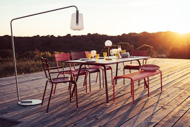
This large open deck instantly lifts your spirits with the warm pinky/red tones of the Luxembourg setting.
Cool colours and pastel hues are calm and soothing or give a sense of security – Cedar Green, Deep Blue, Acapulco Blue, Plum, etc.

In this setting the table blends with the natural surroundsing creating a sense of tranquility
And neutral shades are just that- neutral- think Anthracite, Cotton White, Nutmeg, Storm Grey, Russet and so on.
Look out for our Essential Guide to Colour coming soon and in the meantime take a look through the colour chart and our colour combining suggestions and if you have any questions at all just get in touch!